Converse
Nearly bankrupt, but carrying a storied sports legacy and counterculture cool factor, Converse came to us for the development of an integrated new branding program. Our goal was to re-tell the Converse story to a new generation and position the brand to increase the value of the business.
They can’t outspend their competition, but they can focus on the company's unique strengths and support originality in the world.


Opportunity→
We studied their history, distant and recent, and recommended they be strategically and graphically combined. This would allow them to build on their unique strengths (heritage, basketball domination, contrarian brand, Chuck Taylor All-Stars), and be distinctly different from their more dominant competitors.







Result→
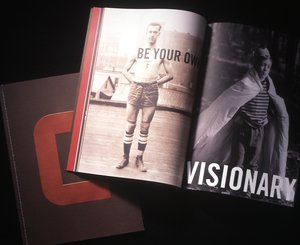
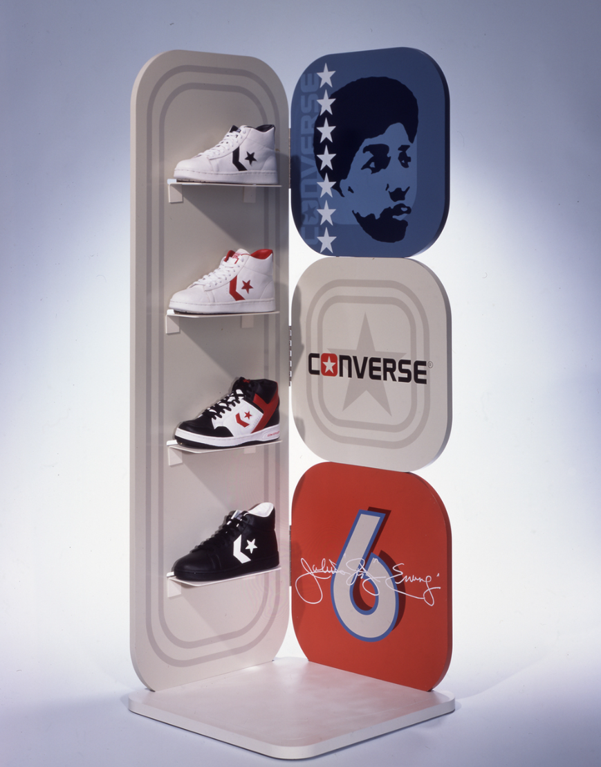
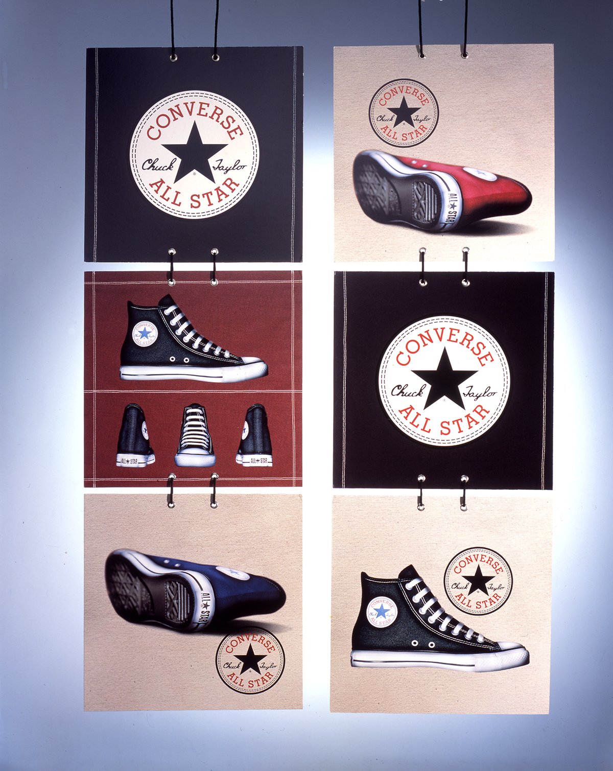
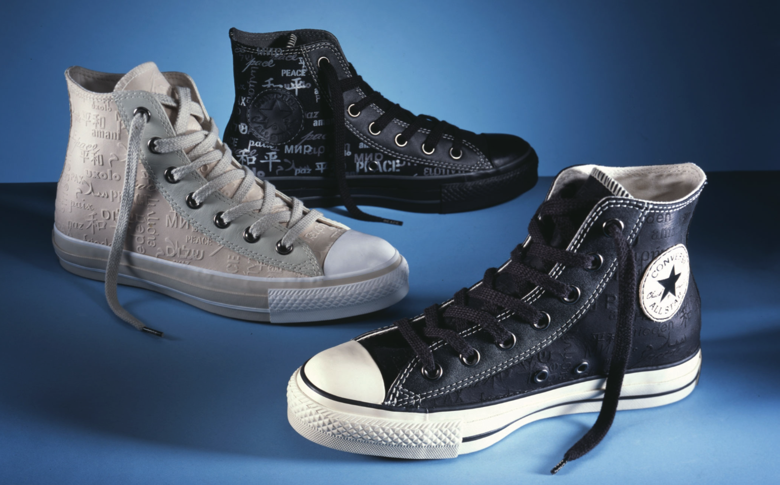
First to emerge was a new identity, constructed from the past with an updated design aesthetic that can last. We recommended that elements from the ubiquitous and long-lasting All-Star shoes become part of the branding, including the grommeted air vents. These elements now appear on most of their product boxes and hang tags, as well as some POS fixtures and collateral. We created a complete brand book for Converse, providing history and insight for every employee to experience where the brand has been, and what their role can be in shaping the future. After all, Converse is an original American icon.
The Converse story entered a new chapter in 2006, when the brand, on a steep rise in sales and market share, was purchased by Nike. Converse successfully rebranded itself, took advantage of its unique heritage, and further strengthened its lifestyle credentials. These all contributed to making them an appealing acquisition and becoming a strategic sub-brand for Nike. Our relationship has expanded to include product design, showroom design, retail space planning, and design, sales presentations, sub-brand naming/ iconography, and more.
